Combining Color: Part I - Nature 
When I design garments, an issue that constantly distracts like a gadfly is the potential for hideous color combination. The idea terrifies me. Color chemistry is a subjective affair, and I would argue that combined colors are only as pleasing as the fabrics they are dyed or printed on. In other words, it’s hard to go wrong with color, so long as the fabrics used are appropriate for the design concept.
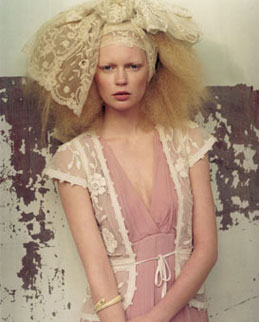
image: Temperley s/s 2006 www.temperleylondon.com
The sparse training I have of sewing and designing clothes has come from the Little House on the Prairie School: designing within utilitarian parameters, using a lot of benign, conservative cotton prints. (I would LOVE to see a Japanese designer’s interpretation of Laura Ingalls chic!)
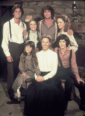
Little House on the Prairie cast of characters www.littlehouseontheprairie.com
I had to take my limited knowledge and move forward, teaching myself how to tastefully combine colors. As can be expected, I looked to nature for lessons. Flower petals are an obvious example of color gradients and subtle transformation from one shade to another:
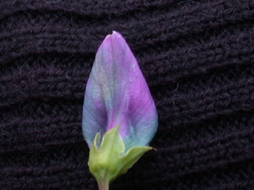
image: flower petal
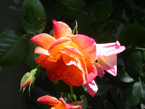
image: rose
The fabric of this dress from Tracey Boyd is a beautiful example of subtle color gradation:
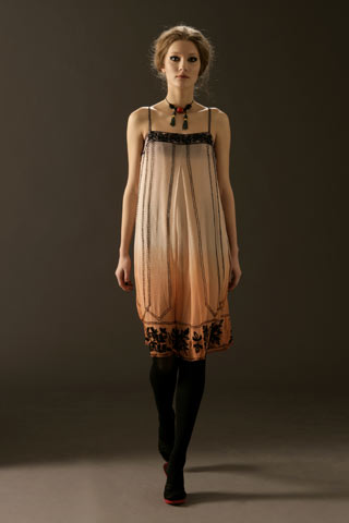
image: Boyd a/w 2006-7 www.vogue.co.uk
It is clear that nature inspires color combinations. What may be less clear (or at least it wasn’t clear to me) is that nature inspires fabric textures and layers. Looks from James Coviello, Easton Pearson and Alice Temperley show how effective a natural color palette is with the right fabric layers:
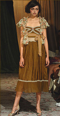
image: James Coviello s/s 2006 www.jamescoviello.com
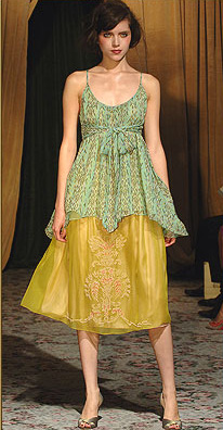
image: James Coviello s/s 2006 www.jamescoviello.com
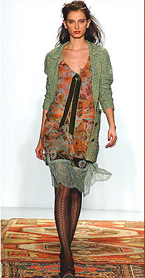
image: James Coviello a/w 2006-7 www.jamescoviello.com
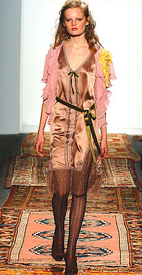
image: James Coviello a/w 2006-7 www.jamescoviello.com
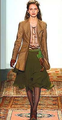
image: James Coviello a/w 2006-7 www.jamescoviello.com
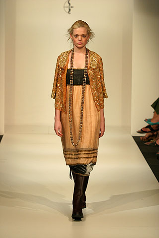
image: Easton Pearson a/w 2006-7 www.vogue.com.au
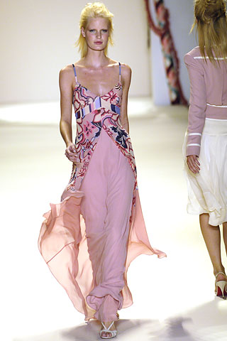
image: Temperley s/s 2006 www.vogue.co.uk
Landscapes are traditionally an endless source of inspiration for prints. I would love to use this silhouette as a repeat pattern on, say, a heavy silk satin:
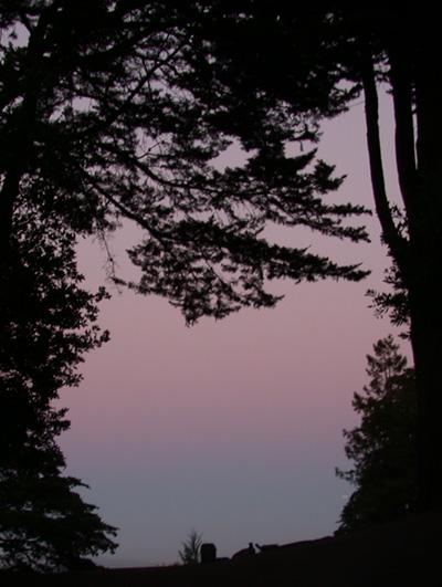
image: Twilight in Buena Vista Park, San Francisco
The silhouette used in this way reminds me of Prada prints from the a/w 2004-5 collection:
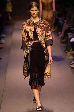
image: Prada a/2 2004-5 www.style.com
An alternative to the above would be to print the silhouette on chiffon or georgette and layer it over the twilight colors in a sturdier fabric.
This review of Vogue covers from the early part of the last century demonstrates how moving color combinations inspired by nature can be:
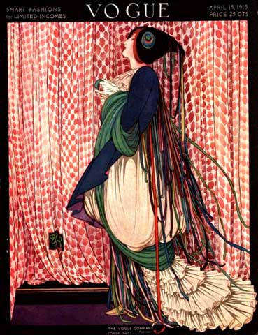
image: Vogue, April 1915 Tyler Lee
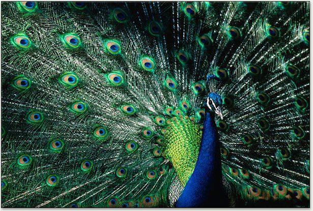
image: peacock www.webexhibits.org
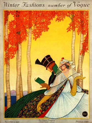
image: Vogue, November 1915 Tyler Lee
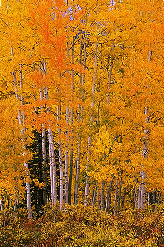
image: aspen www.mycolorado.org
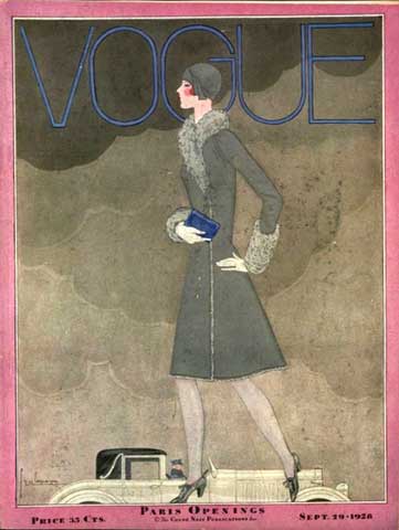
image: Vogue, September 1926 Tyler Lee
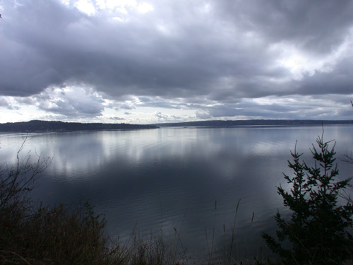
image: Puget Sound, Seattle 2006


July 8th, 2006 at 4:20 pm
To me it isn’t just the contrast and cordination of colors relative to the fabrics, but the combination of texture - likely a whole other subject.